QANTAS FREQUENT FLYER

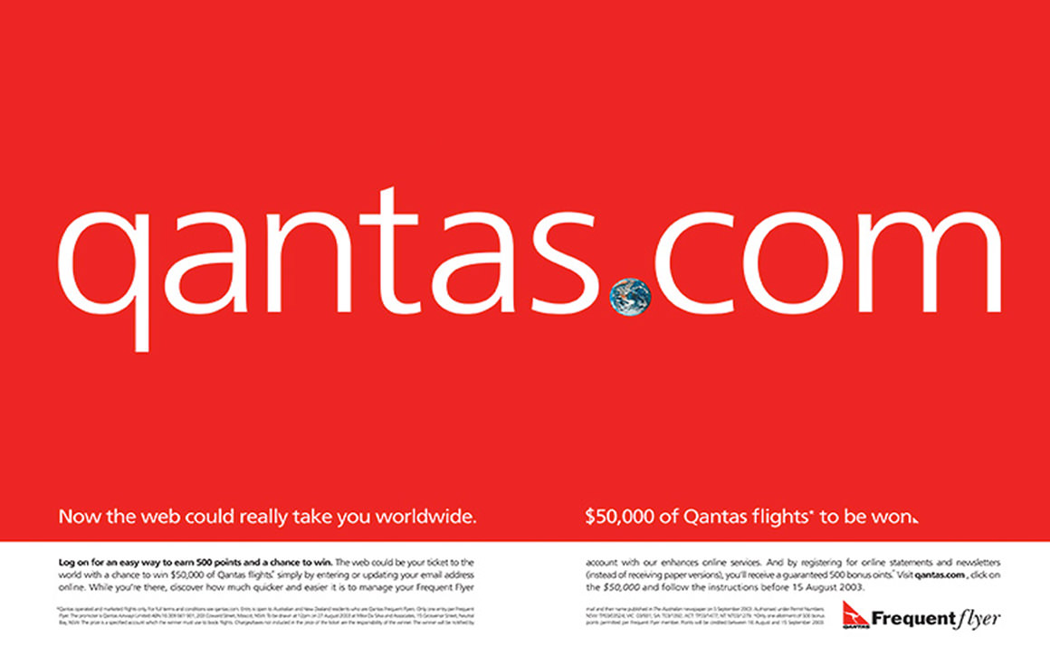
Quantas were re-launching their website, not just a corporate site but with a new booking engine (this was new in the early 2000s). So the whole world was available to customers from qantas.com. In a strong, minimalist typographic execution we put the world in qantas.com as the dot. Ran as press, posters, on the back of boarding cards and pretty much everything they printed for a while.


